| Hello! Here at MorningPrint, we receive many amazing designs, and we really enjoy seeing the creative process the designers go through. We enjoy seeing the results received after we send these designs to print. We would like to share some of these creative designs with you to help inspire you as they have inspired us. |
|
 |
 |
|
|
 |
|
 |
 |
 |
|
 |
|
 |
 |
Q : Briefly tell us about your company, it's history and what kind of services you offer? |
 | |
 |
 |
A : After I had my first child I quit my graphic design job to be a stay at home mom. Although staying at home and taking care of my children was a wonderful blessing, I found it hard to find a creative outlet. I discovered birthdays to be a great way to take care of that creative itch. Designing invitations and parties for my children soon turned into designing for my friends as well. A dear friend of mine encouraged me to start selling my invitations on Etsy (lemonademoments.etsy.com). It took some convincing but much to my surprise and delight Lemonade Moments immediately took off. |
 | |
 |
|
 |
 |
Q : Where did the name Lemonade Moments come from? |
 | |
 |
 |
A : For most of us, lemonade is a drink infused with nostalgia. Just one taste can take us back to lazy summer days when life was carefree and full of joy. My hope is that my designs are the first step to achieving those sweet and refreshing
'lemonade moments'. |
 | |
 |
|
 |
 |
Q : Your design inspires us, what inspires you? |
 | |
 |
 |
A : My inspiration can come in the most random places. I have absolutely no control over when or how it happens. Which is incredibly frustrating and not always conducive to productivity. Grin! I have a deep love for typography. Which started in an old school type setting/press class I took in college. You will often find me snapping pictures of anything with great typography. I get inspirations from vintage posters, packaging, signs and old advertisements. I love the design era from the 20's-50's. |
 | |
 |
|
 |
 |
Q : You added raised ink to the front of your design as well as rounded corners, why did you select these finishings? |
 | |
 |
 |
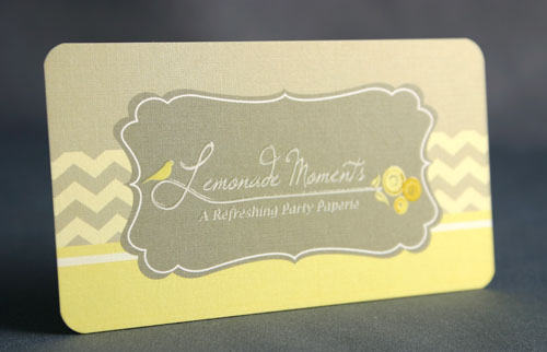
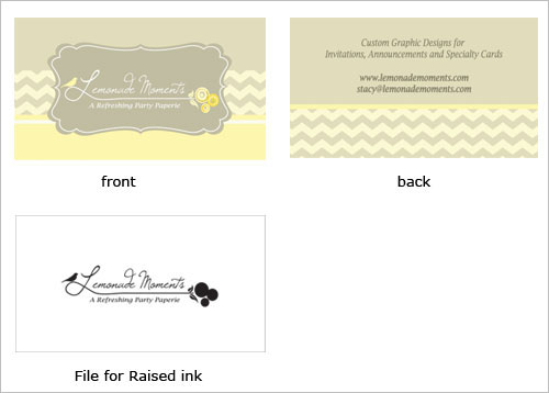
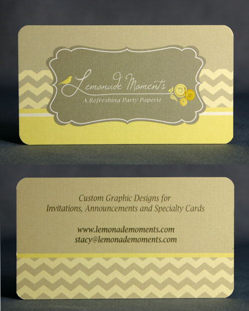
A : I knew I wanted my business card to stand out. I think the linen paper, rounded corners and raised ink really helped with that. |
 | |
 |
|
 |
 |
Q : We love the color scheme of your card, how did you decide on this pallet? |
 | |
 |
 |
A : Well, that was the easiest part. Yellow has always been my favorite color and thankfully also the color of lemonade. It is very cheerful and playful. The characteristics I want to associate with my invitations. It also happens to be a color that is hard to read. I knew I had to choose a background that would compliment without dulling it. Allowing the yellow to be more noticed. I think the neutral taupe does this well. |
 | |
 |
|
 |
 |
Q : Any tips for our clients to consider when they are creating their business cards? |
 | |
 |
 |
A : Make it worth remembering. There are a lot of average business cards floating around. Make sure yours is unique and catchy so that it will grab your audience's attention. |
 | |
 |
|
 |
 |
Q : Did you experience any difficulties when using MorningPrint.com, or find anything to be inconvenient or inefficient? Any suggestions you can offer us to help make the customer experience better? |
 | |
 |
 |
A : No, it was very easy to work with Morning Print. Thank you so much! You have a repeat customer here. |
 | |
 |
|
 About Us >
Design of the Month


