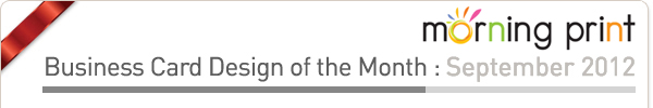
| Hello! Here at MorningPrint, we receive many amazing designs, and we really enjoy seeing the creative process the designers go through. We enjoy seeing the results received after we send these designs to print. We would like to share some of these creative designs with you to help inspire you as they have inspired us. |
|
 |
 |
|
 |
|
 |
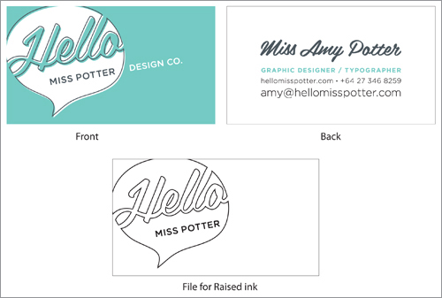
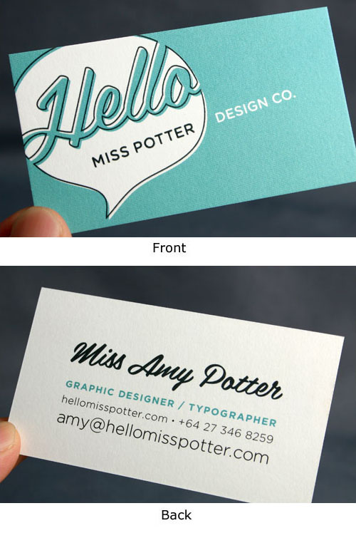
Stock : Heavy Nouveau, Raised Ink |
| |
 |
 |
|
 |
|
|
 |
Q : Briefly tell us about your company, it??s history and what kind of services do you offer? |
 |
|
 |
|
A
: My 'company' is actually just myself! I am a freelance graphic designer, specializing in print design. Mainly I work on branding, business cards, brochures, editorial design and publication projects. |
|
|
|
|
|
|
Q : How did you come up with the name for your company? |
|
|
|
|
A
: My last name is Potter, and I've always been called Miss Potter by so many people, so I knew I wanted to have that as my brand name. However due to the film about Beatrix Potter being called 'Miss Potter', lots of domain names are already taken. So I needed to come up with a friendly word to add on to make the brand name unique, and 'hello' was what I ended up choosing. |
|
|
|
|
|
|
Q
: Your design inspires us, what inspires you? |
|
|
|
|
A
: Usually just getting outside (hopefully with my camera) and looking around, which I must admit I wish I was doing more often these days. I like to sketch with old fashioned pencil and paper, I often find ideas flow better that way.
|
|
|
|
|
|
|
Q
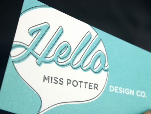
: You added raised ink to the front of your design , why did you select this finishing? |
|
|
|
|
A
: Being a print designer, I wanted the card to have a tactile element to it so when I handed it over the recipient would immediately feel it was something special. The beauty and feel of print is so important, the way your business card looks and feels says a lot about your brand. You only get one chance to make a good first impression! |
|
|
|
|
|
|
Q
: Your card has a simple, clean, yet effective design, how did you come up with this? Did you free hand any of the elements on the front of your design? |
|
|
|
|
A
: The design is an adaptation of my logo (you can see it at hellomisspotter.com) which I blew up and played around with to get a graphic design for the front of the card. I drew all the shapes in Adobe Illustrator. I chose a speech bubble for my logo because design is all about communication, and more obviously to link to the 'hello' in the brand name. |
|
|
|
|
|
|
Q
: We love the color scheme of your card, how did you decide on this pallet? |
|
|
|
|
A
: The colour took a really long time for me to settle on! While I was designing the card I probably went through at least 10 different colour-ways before I arrived at this one. In the end it came down to 2 things: I really wanted a bright colour (because I love colour!) and I wanted a colour that wasn't too feminine. The colour I chose is also a colour that I am wearing a lot at the moment, so I feel it reflects my personality quite well. |
|
|
|
|
|
|
Q
: Any tips for our clients to consider when they are creating their business cards? |
|
|
|
|
A
: I try and get my clients to really think about what they want someone receiving their business card to think about their business. You can have a really great first meeting with someone, and make a really great impression, but your card is the piece of you that person takes away with them. The object they refer to when contacting you again. The quality and personality of your business needs to be reflected in your cards! |
|
|
|
|
|
|
Q
: Did you experience any difficulties when using MorningPrint.com, or find anything to be inconvenient or inefficient?
|
|
|
|
|
A
: The only thing I wish MorningPrint offered (which would make them darn near perfect!) would be a spot colour printing service rather than just straight cmyk. But you know, that's just a wish list thing, not a must have! Overall I found the service incredibly easy to use and delivery to the other side of the world was very efficient. |
|
|
|
|
 |
|
|
|
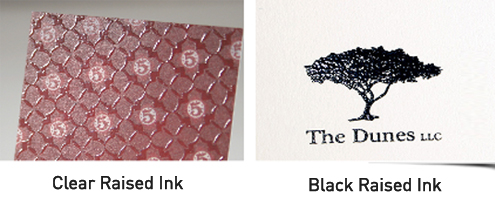
Black Raied Ink VS Clear Raised Ink |
|
|
|
There are two types of raised ink: black and clear. If the requested area for raised ink is
100% black we use the black raised ink. If the requested area for raised ink has other colors
a clear ink is used.
Suggested raised ink: MorningPrint suggests using the Raised ink Option with all
100% black text on white stock as the black ink has a more precise effect.
 |
|
|
|
|

 About Us >
NOTICE
About Us >
NOTICE